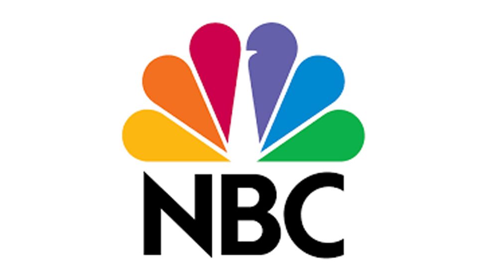
NBC's Peacock logo, introduced on May 12, 1986, during the network's 60th Anniversary Celebration, marks 40 years as a broadcasting icon. The unveiling occurred at the end of a star-studded special hosted by 'The Cosby Show' stars Malcolm-Jamal Warner and Keshia Knight Pulliam, featuring figures like Bob Hope and Johnny Carson.
Design Origins and Evolution
The logo's six-feather design was crafted by Chermayeff & Geismar, signifying NBC's divisions: Entertainment, News, Sports, Network, Stations, and Radio, with each feather in a distinct color. Former NBCUniversal chief marketing officer John Miller praised its simplicity and agelessness, noting its 90% recognition rate alongside the Nike swoosh and McDonald's arches.
The Journey to the Modern Peacock
Before the Peacock, NBC's visual identity included block letters and the 'snake' logo, followed by the 'Big N' which led to a costly settlement with Nebraska ETV over design rights. In 1979, NBC added a Peacock to the logo, but deemed it too busy, prompting a redesign.
Strategic Delays and Legacy
Under boss Fred Silverman, NBC planned a simplified rebranding, but Grant Tinker delayed implementation until NBC regained its footing with hit shows like 'The Cosby Show' and 'Cheers.' The logo debuted with the 'Come Home To NBC' campaign during a revitalized era.
Peacock's Enduring Impact
Despite changes, the Peacock's flexibility meant it adapted to shifts, like the sale of NBC's radio division. Its design rules were frequently challenged, but the logo's strength grew, branding entities like CNBC and MSNBC, and today it represents Comcast Corporation.
Miller reflects on the Peacock's enduring value, affirming its role as a robust brand asset across various platforms.
Source: https://variety.com/2026/tv/news/nbc-peacock-logo-turns-40-history-design-1236746136/